Phase 3b: Design (On paper prototyping)
Paper prototyping has been a well known and widely used technique to test navigation and usability. However, I'm still curious as to why it is still so successful, even in today's context.
I chanced upon this website that i feel was quite useful. It answered some of our project's issues (and my doubts). Its called, "Five Paper Prototyping Tips" (http://www.uie.com/articles/prototyping_tips/)
Here's the 5 rules/tips mentioned, which i feel is very relevant, and some key takeaways from the site:
1. I’m proficient with HTML. I can create a working prototype fairly quickly. Why would I want to use paper prototyping?
"changes can be made on the fly during a test"
With just an eraser and pencil, changes can be done quickly. What I liken about paper prototype is that, its PORTABLE. It can be tested on the go, on the bus, mrt and places without internet connections etc.
"users feel more comfortable being critical of a paper prototype"
I think it's very true, esp for myself. I will usually not critise people's work, esp when you see them spent so much time and effort doing it. But when presented on paper, it feels more comfortable for me to voice out something that I feel is somewhat not right.
"With paper, all the team members can gather around one table with their eyes on the same design"
Very good point! I'm sure most of the peers experience this. Whenever there's project meeting, and when each of the individuals' lappy is on, there will usually be no focus on discussion. Everyone will be doing their own thing, and usually, one 'facilitator' needs to step up and get everyone's attention. Thus sometimes, I prefer meetings without lappies, or with lappies off. :)
2. How can I use paper mockups to test new technology? Trying to mimic Macromedia Flash using paper mockups sounds like a nightmare—and how would we create rollovers?
"The goal in testing a prototype is to create a usable site"
As the project requires interactivity, we will most likely turn to flash as part of our designing tool. So we faced a similar question on how to present visual that we intended to do, on a paper. Is it necessary? I guess not so, perhaps just a rough one.
"The inability to prototype a fancy effect on paper may be a warning that the effect is not usable"
I kinda 'disagree' though. It might not be usable per se, but it might have additional effects, such as UX.
"Users often choose a link to click on before seeing the associated content in a rollover"
True and not true. Some sites are really straight forward. But there's some whereby the links are actually 'pictures' embedded into the background. I cant help but just move my mouse around the screen and see is there any animations played (indication of a button).
"Paper mockups don’t need to incorporate all the frills of technology"
We will keep this in mind. :)
3. Our product has been up and running for a while. Why go back and create mockups to test an existing product? When should we start from scratch with paper?
(omitted for the purpose of this project)
4. How do you create a prototype that relies on a database? Do you create fake accounts? It seems like a ton of paperwork.
"it’s often impractical to have lots of data available"
As our team proposes a site that has a huge database of car parking info and booking data, i'm glad i read this statement. heh.
"In cases where users must look up data that is not provided in a prototype, we create tasks in such a way that we can predict the data"
As mentioned in the article, make testers do specific items, for our case, a specific car park.
"When a user enters real data into a field and the data needs to appear somewhere else later, we rely on sticky paper"
This will come in handy for stuff like registration page, or booking page.
5. It’s not easy to make links look like links in a prototype. How do you help users identify a link?
"If we see users click something time and again that isn’t a link, it’s clear what’s needed—make it a link"
Biggest takeaway.
Friday, March 28, 2008
Thursday, March 27, 2008
Final Project: Designing for UX V
PHASE 3b: Design
Just had a discussion with boon and min for next week's 3b deliverables. They are mainly,
Just had a discussion with boon and min for next week's 3b deliverables. They are mainly,
- conceptual design
- paper prototype
- user walkthrough
- analysis
We are all rather excited to see how the website will turn out to be. Anxious is the word. It's ways nice and fun and we reach the 'implementation' stage of the design, where we put our knowledge into practice. Hopefully in 2 to 3 weeks time, the prototype is ok looking and decent to use. :)
Conceptual Design
We're heading back to 'basics' for this part, looking into how we can design our website into one which is both usable and has UX. Not easy. We'll most likely take into consideration Norman's theories in designing. Lots of issue to discuss and design. Visual, navigation, visibility, affordances and others.
Paper Prototype & User walkthru
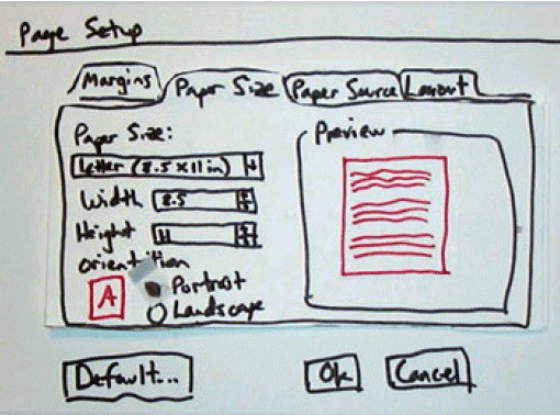
We chose this as our low fidelity prototype. Although i think that doing a high fidelity prototype of our website might be more suitable, but time is not on our side. High F enables a more complete user research and analysis, and allows users to have a better feel to the final prototype. Paper wise, we cant get as much out of it, but something is better than nothing, heh. At least they can roughly "navigate" through our system while we study them.
Our PAL team is pretty much packed this week with our other modules' submission and quizzes. So not much choice but to stick with paper. We'll be coming out with something like this: (but neater :) )
Analysis
I'll post this part once we conduct our user walk thru this weekend. Till then...
Wednesday, March 26, 2008
Final Project: Designing for UX IV
PHASE 3a: Design
Our team presented our slides earlier today and the coverage included:
Information Structure (card sorting + site map)
As there was no report submission required, we could focus more on the information structure / site map (card sorting) and the flowchart.
During the weekends, we discussed and decided on using card sorting achieve our information structure. We felt that it was most appropriate as we are doing up an interactive website with much contents that needs to be organized.
We had a total of 30 items to be sorted and we made it an 'open sort', allowing users to label the categories as they deemed fit. We really wanted to see how 'users' sees them differently, from say, the designers of the system (us). Ethnography studies was took into consideration, but we felt that card sorting is something we have yet to try b4, thus, an additional 'excuse' to use execute it. heh.
We targetted 12 participants in total, 8 for a general card sorting exercise done @ optimalsort.com (http://park-a-lot.optimalsort.com/parkalot/userwelcome.php) but the online activity expired/closed on the 24th March 08. It was a free tool that we chanced upon when researching on information architecture and card sorting. It saved both the PAL team and the respondents some precious weekend time and allowing us to process the analysis quicker.
Personas card sorting
As for the other 4, we improvised the card sorting a little by targetting directly at the 2 personas profiles that we highlighted previously, mainly the convenience seekers and the price conscious. We had 2 personas for each category (total 4) and conducted a live card sorting activity with them.

We analysed all the 12 participants, and came up with mainly 7 categories for our site map:
Our team presented our slides earlier today and the coverage included:
- our products
- our target audience
- experience strategy (overall)
- functionality (brief summary)
- information structure + sitemap(the focal point)
- flowchart (user common tasks)
Information Structure (card sorting + site map)
As there was no report submission required, we could focus more on the information structure / site map (card sorting) and the flowchart.
During the weekends, we discussed and decided on using card sorting achieve our information structure. We felt that it was most appropriate as we are doing up an interactive website with much contents that needs to be organized.
We had a total of 30 items to be sorted and we made it an 'open sort', allowing users to label the categories as they deemed fit. We really wanted to see how 'users' sees them differently, from say, the designers of the system (us). Ethnography studies was took into consideration, but we felt that card sorting is something we have yet to try b4, thus, an additional 'excuse' to use execute it. heh.
We targetted 12 participants in total, 8 for a general card sorting exercise done @ optimalsort.com (http://park-a-lot.optimalsort.com/parkalot/userwelcome.php) but the online activity expired/closed on the 24th March 08. It was a free tool that we chanced upon when researching on information architecture and card sorting. It saved both the PAL team and the respondents some precious weekend time and allowing us to process the analysis quicker.
Personas card sorting
As for the other 4, we improvised the card sorting a little by targetting directly at the 2 personas profiles that we highlighted previously, mainly the convenience seekers and the price conscious. We had 2 personas for each category (total 4) and conducted a live card sorting activity with them.

We analysed all the 12 participants, and came up with mainly 7 categories for our site map:
- car park information
- booking info
- member's detail
- viewing of live info
- search
- faq
- statistical graphs and charts
This is the 1st draft from our findings and analysis. I forsee us finetuning it based on future research, such as paper prototyping and etc, or based on other factors and comments from users.
Comments and feedbacks
Some questioned was raised by Mr. Reddy with regards to the security of the transaction, the booking procedure (users supposed to key in credit info everytime they book etc) and the issues of the physical landscape, along with the potential troubles and problems that we might face, such as people exceeding his parking / booking period. We have gave some thoughts to them previously, and we will be very much finalised our proposed solution (the 3 possible implementations mentioned in earlier posts) We have to weigh the pros and cons and think thru the possible outcomes and things that can/might happen.
Next week will be crunch time, Phase 3b, which is very much the start of the 'technincal work' of our product. We have already done our paper prototype and we will get them evaluated this week, before proceeding with our website.
Deliverables next week are:
- concept generation
- low fidelity prototype (there's no way we can do up a high fidelity prototype without the expense of other modules! heh.)
- user evaluation: walk thru
till then.... :)
Reflections on reading: User Research Smoke & Mirrors (part 1 to 5)
link to article (http://www.graphpaper.com/2006/07-10_user-research-smoke-mirrors-part-1-design-vs-science)

Design vs Science
I was really surprised at how straightforward the article was written. Direct and no holds barred! It's always nice to read a paper from a "designer's perspective" as to "philosopher's perspective"), especially when I'm from Sch of Computing. Ha.
Back on the article, there's this discussion on design vs science, and particularly, eyetracking technology.
I have to admit that I would have agreed fully to what Christopher Fahey have said on the perks of design and the downside of science. My initial feel (and i always thought so) was that so long as the site is visually pleasing, navaigation is done properly, content organized in an uncluttered manner, the website can do its job of communicating information and serve its purpose. Design truimphs.
However, taking "NM5210 - critical interactive media design issues" gave me a really different light to website designing, or more particularly, enabling a positive communication of knowledge and ideas to the users. Although I have much trouble reading the papers and readings, I somewhat and somehow (i hope) am able to grasp some key insights as to what science is able to provide.
Of cos, if the website is mainly just about "our products" "about us" "contact us" etc, then design truimphs in doing so, and user research can pretty much suppliment the goodness of the website, without much help needed from science. But then, cognitive science is really something that designers should have in mind when designing stuff, and that carrying out experiments is rather crucial.
I had a hard time understanding cognitive science (and still do) because the scope of this term is extremely large. Psychology, philosophy, neuroscience, linguistics, anthropology, computer science, and biology etc. But then, from the papers that i've read, it seems to indicate that design and science are "separate entities", i.e. to say, most designers are not made known to science's research based principles.
Designers usually apply design principles, like norman's visceral, behavioural and reflective, affordances, feedback, mapping, visibility etc, applying ad-hoc principles to their website designs, and do not take much into considerations of the science's portion, things like scaffolding and learning theories etc. There seems to be a gap needed to be bridged between design and user research, with science and its theoritical, empirical studies etc, in order to provide users with websites that are both functional and provides UX.
Convincing the boss / clients
It was really funny how the writer mentioned about convincing the boss or the clients, throwing in all sort of "supporting documents" to induce them in giving them the nod of a job well done. Having some personal experience on freelance jobs and school projects, it is somewhat diffcult to convey the design issues to them, esp when one doesnt know what he or she wants, or when they dont browse their own websites often. I edited the mario pic that he posted in his article, and hopefully, he can use or try this tactic in the future. Who knows? It might work . :)
The bullshit thingy is quite humorous though. Finding means and ways to clinch deals. There's really lots of issues for one to ponder.
Designing something u think is good
Designing something u think end users will like
Designing something u think boss will like but u know clients wont like
Designing something u think clients will like but end users wont like
and the list goes on...
Tuesday, March 25, 2008
Final Project: Designing for UX III
PHASE 2: DEFINE
The deliverables for this phase is quite a bit, esp coming out with the persona and experience strategies (something that is quite 'open' in a way)
Deliverables are:
i) report on phase 2
ii) 8 min presentation
- Need for product
- Possible solutions (based on user research)
- Target users and user profile
- Personas - advanced and anti user
- Functionality specifications
- Experience strategy
- Product benefit specification
Need for product (Focus Group)
To finish up where we started off, we decided to do a quick focus group with 15 respondents, with the aim of gathering more data and info on the needs and proposed solutions for PAL, as we felt that the initial interview results was decent, but not sufficient.
The focus group was proved useful to us, with most agreeable with what we are proposing, but suggested some interesting stuff ( to be elaborated below )
The 5 main takeaways (in brief) from our analysis are:
i) timeliness info (high accuracy of information, 24/7, up-to-date)
ii) navigation (ease of browsing, organized website)
iii) concise booking procedures (for both online and sms. Step by step guide preferred)
iv) secured and cashless (major credit cards and topping up via AXS stations/7-11)
v) affordability (low or minimal booking fee)
Target Users and profile
The Assignment 2 that we did did proved useful! We were able to churn out the persona profiling with previous knowledge of the dos and donts. We finally came out with "The Convenience Seekers" and the opposing "Price Conscious". Ultimately, our product does cater/ or hope to cater to users/drivers who wants to be in control of their time, being able to book a lot @ their own convenience and enjoy the perks of the seamless and convenient booking system. Time saved. As the saying goes, a happy customer is a paying customer (my saying, haha), making it a win win situation to both parties (users and client).
Functionality Specifications
The entire research and project is pretty much user based, thus our approach of the user-centric design. With much info gathered from the interview and focus group, we were able to come out with the functionality requirements, which are mainly,
i) Aesthetics (simplicity, visually pleasing, balance of images, text, animation)
ii) Workflow & Info Architecture (Uncluttered, 3 clicks approach, speedy system response)
iii) Interactivity (one of our key in providing UX in our website. Must have visibility, affordance and mapping in an unique and interactive format)
We try to keep our focus in these 3 main areas first, if not, there will most definitely be a tendency of having a feature creep. We will then be stuck in the 'overpromise, underdeliver' situation.
However, we will still keep users in the loop thruout the creation of our product life cycle, making appropriate changes and additional features when necessary.
Experience Strategies
This was sort of the 'toughest' part of this phase's deliverables. Although we firmly believe in the user centric design, we are also aware of the cons that it potentially brings. One harmful aspect as mentioned by Norman is the possibilities that we change something/feature for a certain group of users, but indirectly making another group 'unhappy'. It seems like a double edged sword. We should weigh the cost and benefits before doing the change. This leads to one of our X Strategies: Increase adoptions and conversions.
We will and want to make improvements and changes, but the end product that we are seeking from changing, is to get new conversions of users, and not losing current ones!
The other important point is to enhance customer satisfaction thru maintaining the system's interactivity and asethetics. It is somewhat agreeable to the phase "Attractive things work better", and this goes inline with BJ Fogg (Stanford)'s emphasis on persuasion (thru visual designs and expected content)
These 2 major experience strategies, along with UCD, are pretty much our focal point in our PAL system.
Comments and feedback
There wasnt as much feedback to most of the groups as compared to the presentation on phase 1. Perhaps most of the people were rather critical initially to the novelty ideas presented (something which Mr. Reddy forced us to do, ahah.)
One quick note from gerald was that he mentioned the high take up rate of GPS in the states and he believes that our system can go hand in hand with the GPS system rather well. We agreed totally. As per our 1st presentation, we mentioned GPS as one of the medium that we are hoping to use. However, the take up rate is still not high at all. I think its like, less than 5% of the private vehicles are equipped with GPS. HOWEVER,
if you read the news recently (a blog's perspective - http://blog.simplyjean.com/2008/02/07/singapore-to-adapt-gps-for-erp-and-other-miscellaneous-stuffs/) it seems that in the near future, most, if not all vehicles will have GPS "connectivity" onboard them. This will really make our system high integrated to the GPS technology, and thus, more convenience to the end users.
Final Project: Designing for UX II
PHASE 1 : DISCOVER part II (Need Analysis)
Immediately after the approval of the idea, we (PAL Team) went straight to our fav brain storming area (discussion room @ central library) and started another long session of storming... brand name, taglines, product name, company name, client, end user etc etc. We spent a long time thinking of the name "Park-A-Lot", ahha. REALLY LONG.
Then came the thinking process for the deliverables for Need Analysis,
i) 1000 words report (proposal)
ii) powerpoint presentation of need analysis
We drafted out our present scenario, looking into and fine tuning our original idea of the need, which is solving the car parking issue, and better time management when people drive to town/cbd. We also went to find some local statistics from government sources and are really overwhelmed by the statistics.
In 2006. 71% of population has household access to internet
In 2008 Jan to June, there's 5.8 million mobile subscribers
We also then conducted a short interview session with 20 respondents, asking them about the present scenario of car parking and getting a response from them. As we had less than 1 week, a full scale interview was difficult. Nevertheless, the response from the were extremely positive.
Most of them felt such a problem and would gladly see what we can offer to solve the problem.
Some quotes from them:
"parking very expensive"
"difficult to find place to park"
"try not to drive there"
"sian"
Business Objectives
With the above mentioned, we aim to achieve and implement a full fletch system to cater for the needs of the service in providing
i) higher certainty of parking lots
ii) better time management to drivers
iii) providing better overall car parking experience (directly or indirectly, to both clients and end users of the system)
Target Group
We then went on to define our target group: Mainly driver of all age groups. For the initial phase, we aim to target at shoppers in town, along with workers and frequent travellers in CBD. We also tot of narrowing down to the young working adults and middle class workers, who are mostly likely IT savvy.
Park-A-Lot System
Although we were only suppose to present the Needs, we thought that we should have something tangible for our "clients" (peers) to have a better feel of what we are proposing. We have not think too in depth, just the medium that we are going to use and a one liner description of the system.With the strong supporting statistics that we have gathered, we decided to aim both the online and mobile group to better cater to their needs. Website + SMS + GPS (future, based on future take up rate) These 2 + 1 services allows users to view and book lots 24/7.
Comments and feedback
The response was generally ok. Not much critical feedback (phew~) but some concerns and positives were raised.
Problem on specific lot
Wei wei mentioned about the issues that might occur if we are to implement and allow people to book a "Specific Lot" in the mall. Our group has actually went though a lot of storming regarding this, and we came up with 3 initial solutions to the implementation of the idea (booking of lot).
i) Booking of specific lot (best and most marketable, but will run into many forseeable and unforseeable problems, such as people overrunning their booking period etc etc)
ii) A lot at an enclosed booking region (perhaps 10% of the total capacity of the mall and will adapt accordingly to market situations. Will have less problems)
iii) By entry booking (Suppose there's 1000 lots, and 50 booked by users. The gantry will only allow 950 non-bookings to go thru, leaving 50 empty lots for the 50 users)However, these 3 ideas are not fool proof, and there's some actual assumptions that we have/will make/made. Such as, the mall will not be fully parked throughout the entire night etc etc.
Problem on physical landscape
Another issue pointed out is of course, whether the users are able to make their way to the gantry without avoiding the long queue that is already present. We also tot of this before the presentation and some suggestions and assumptions are:
i) supposed the client agrees to the idea, they are willing to make additional entries solely for season parking users and users of PAL
ii) allowing back door entry (like season parking works), usually thru loading bay etc
iii) and etc
the next phase is the define phase, a deeper analysis of the needs, persona profiling and experience strategies.
Final Project: Designing for UX I
PHASE 1 : DISCOVER part I
For the past one month, we have been busy with the final project for NM4210. I'm teaming with boon and min, the same team for assignment 3: Improving the learning experience @ lecture theatre. This time around, the workload is 2 to 3 times more!
Here's the project description: "For final project you have to actually design and develop (prototype) an interactive product. This could be a website, a software application, a game...." Yap, short and sweet, with many possibilities. Heh.
With much research and the lectures given by Mr. Reddy, we somewhat know what is 'user experience'... but the tough part is the idea! We were initially quite blurred by the requirements, as we tot that it was supposed to be an "IT" product, something that got to do with technology. After clarifications, we were told that any product or idea is ok, so long its a good and money making product. Heh. So that widen the scope, a little.
Initial Ideas & Brainstorming
It is always the toughest part, thinking of a novelty idea or product that can earn millions. Especially when we need to come out with something that has the fine elements of usability and UX. The former is already quite tough, let alone combining both of them together. And then there's this common human tendency tat we always try to think of a product first b4 solving a need. Very wrong.
Although we might end up with the same end product (coincidently), looking for the perspective of solving a need is very much more critical than taking care of the functionality the product has. It is something Mr Reddy strongly emphasize on, even on other modules, like 2208 or 3208, and even 4205. If we started off with a product, what we will be doing is to fine tune the product, and not finetuning the needs. I'm sure most of us are caught in similar situations before. Heh. (Staying true to this methodology or philosophy did help us coming out with PAL, and some other critical projects, like the stock market stimulator in 3208.)
Apart from that, we had to define our end users, our clients and our very own company~ There are just many needs to be solved. But the solutions to it is either already created or it's not fanatastic at all.
It was rough initially, having some of our ideas rejected by Mr. Reddy during class. The 1st was to solve the problem of the long queues @ most, if not all, ladies toilet. I think there is a general need for this problem, but our proposed solution is some what already been done, overseas. And according to Mr. Reddy, was quite a failure. Sigh. We kinda knew of 2 products that can indirectly solve this problem, make that 3 (<--this is quite nonsense and straightforward)
1st was a urinal meant for ladies. 2nd was the paper funnel thingy that allows ladies to use the normal mens' urinal. The 3rd, well, is to simply allocate more space allocation to the ladies toilet when architects are designing new malls etc...
Our idea was actually to build a small compartment, big enough to allow ladies to do their thing, but much smaller than the current cubicle. As our product was meant to allow ladies to do "small business" only, it allowed us to make the "compartments" small. We also wanted to redesign the urinal (ladies) and to promote a "new experience" when using our "compartment".
I felt quite positively for this idea, but when Mr. Reddy told us that the whole urinal thingy was a failure, we didnt pushed for it further (although i still feel something can be done! i might, if i have the $ in the future.)
The 2nd idea was from boon. He felt that the IBM lappies are kind boring, mainly black and mechnically looking. Something can be done to it. So we tot of ideas to repackage it into a more vibrant product, as we know that IBM are known for their stability and fine architecture for their lappies. But then, the feedback was that it was kinda turning into a "campaign" or a sales or marketing thingy... Thus, no more pursuing of the idea.
Some other ideas came to our minds too, but most are rejected too. ARGH.
So finally..........
Draft Idea
We met a couple of times more in school @ library and cracked our brains... trying to think more novelties..... And we had 2! After many hours of brainstorming and feedbacks from one another...
Boon went to meet Mr. Reddy as min n i couldnt make it during that time slot. And we have some positive results.
The 1st was something to do with weight management. (which died too).
The 2nd and the final idea that got "accepted" is....... PARK A LOT SYSTEM!
This system/product serves and tries to solve the need of looking for a car park @ town / CBD (better time management) As most drivers will know, securing a lot at the major malls are rather difficult, esp so during peak periods.
So this system, Park-A-Lot (PAL) allows 24/7 viewing of live car park information and also the booking of a lot! Yap. We envision that drivers are allowed to book lots even b4 reaching their destination. This saves precious time queueing and hunting for a lot. less hassle. more convenience.
And so, we stayed on with this idea, and pushed on...
Subscribe to:
Posts (Atom)
